Hello dear friends. How have you been?
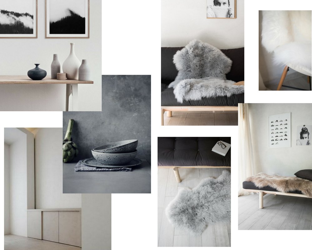
Today I would like to share with you my top practical tips for using moodboards as styling direction. As you may already know, a moodboard is an inspiration board that combines images, colors, and textures to define the style of a project, used as a visual communication tool to get your thoughts and ideas across to others. It can be very simple (a few images attached can be enough to understand each other or define your project!) or more complex.
Sometimes it is hard to know what you want.
But you know it when you see it, right?
It it is essential in the work of stylist to make sure both client and stylist/photographer are on the same page. The ideas for the moodboard can come from all around you (although most of the time the images come from Pinterest!). Magazine, movies, early morning walk–you can use just about anything to communicate your visual style and create concept. Once I receive the moodboard from the client with the idea of they would like their products to look, I am ready to start.
Here are my top 4 tips how I interpret the moodboards and translate the images into your styling:
1/ The idea behind the visual identity – it is very important to understand the message your client wants to send, the concept behind the visuals, the mood, the ‘heart’ of the campaign. What are the values you see in the board?
2/ Understand the style – recognize the style – is it minimal style? scandinavian? boho? vintage? Once you know the style you can find the right location, style the scene, use the right props to create the desired effect (items/decorations).
3/ Color palette – what are the main colors of the moodboard? Detect 3 main colors and 2-3 seconday tones. Make sure to translate them into your styling.
4/ Textures – textures play important role in creating the mood so pay attention to what textures (raw/smooth/marble/wood) are visible in your moodboard and try to follow that direction, use matching materials.
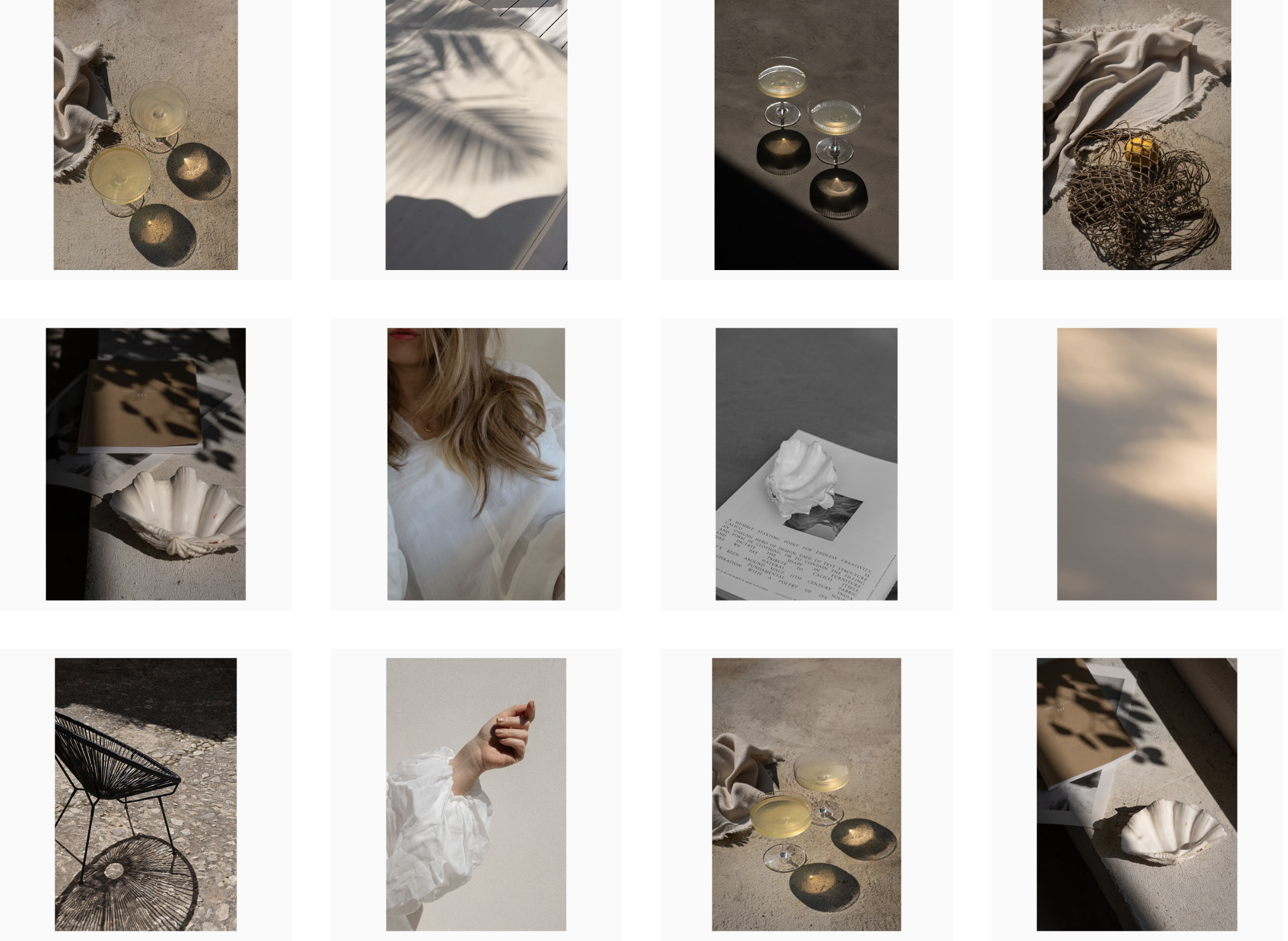
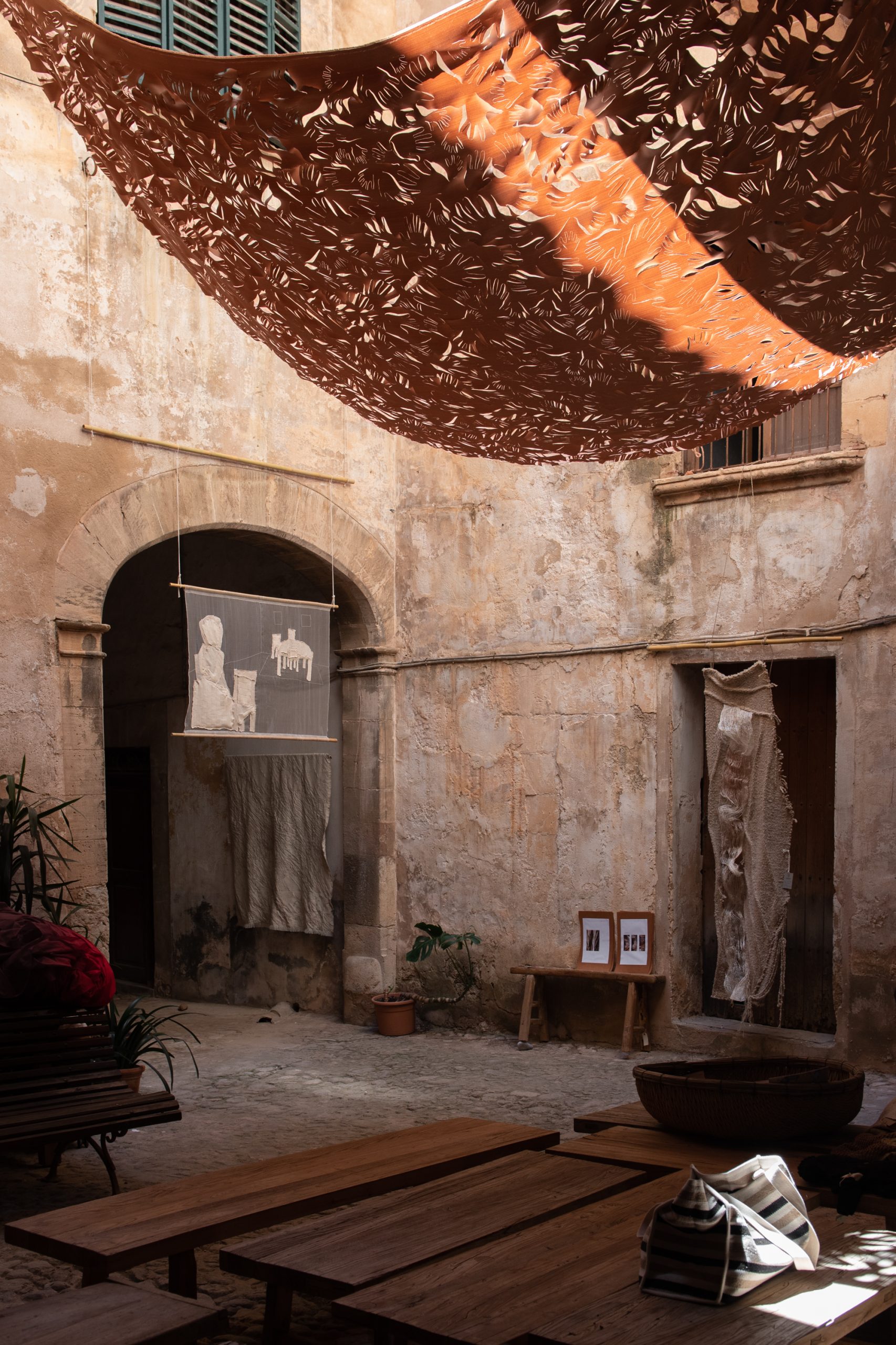
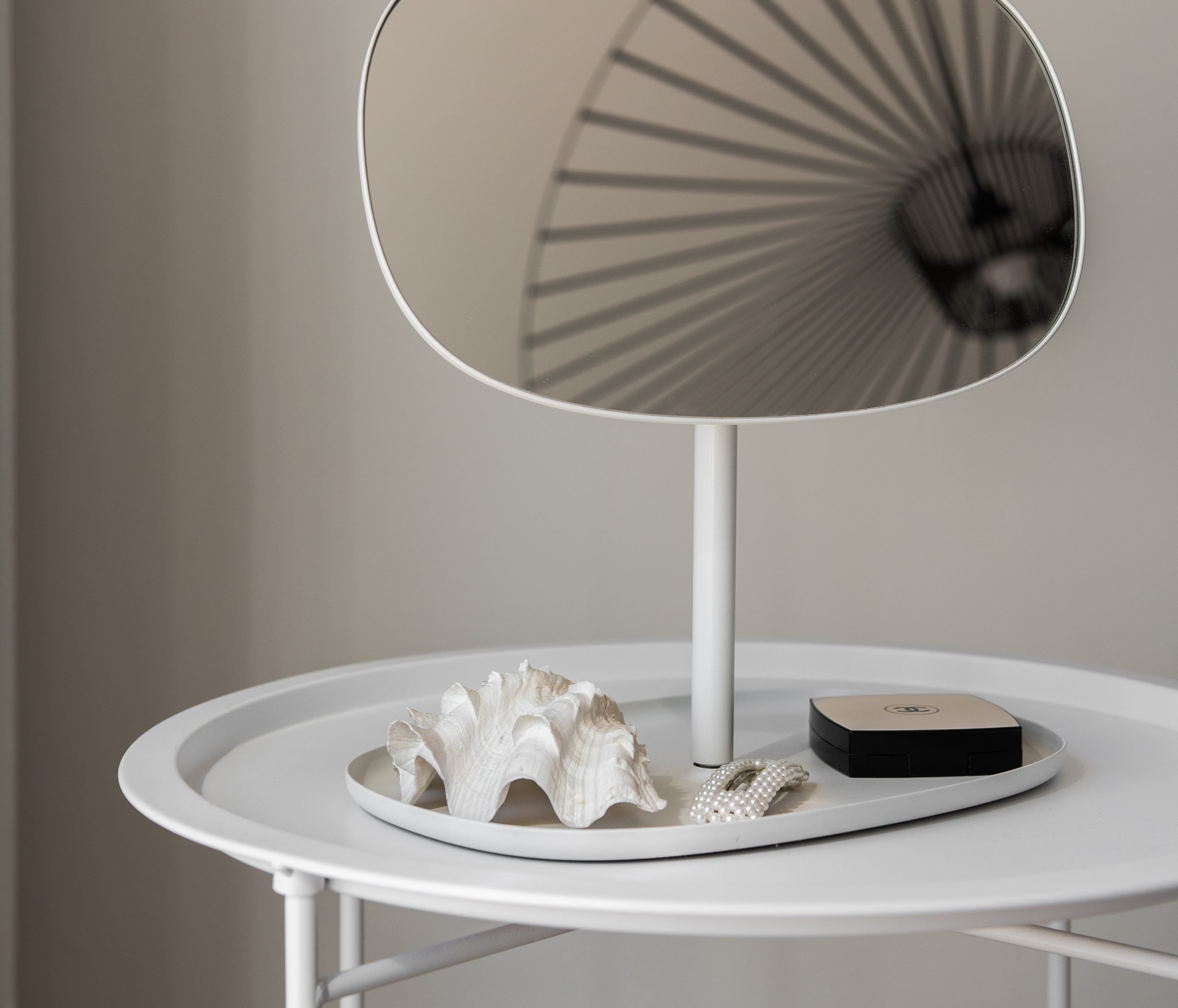
This is how I translated images sent from a client (3 images on the left) into a product photoshoot, sheepskin rugs. What do you think of the final result?

Do you work with moodboard? Do you find them helpful?
Styling/Photos – moodboard + Agata Dimmich / Passionshake


