Hello. How have you been?
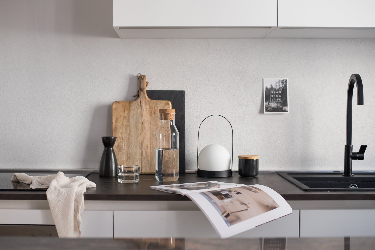
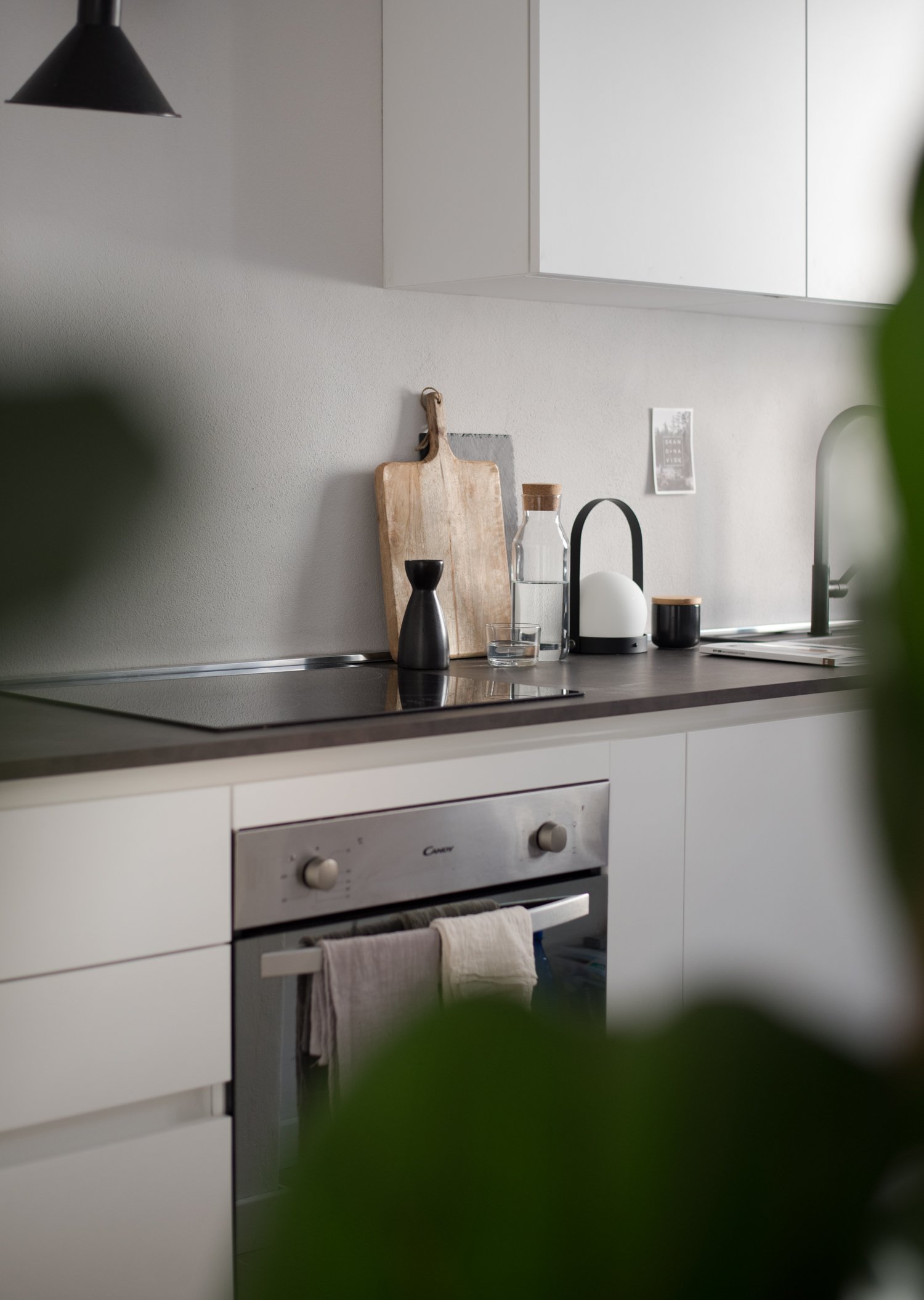
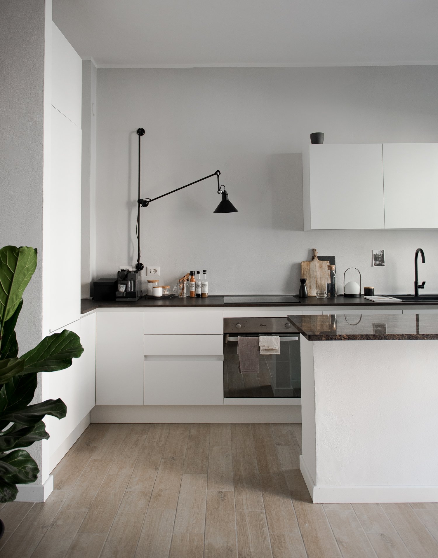
I’m excited to finally show you our minimal kitchen design.
As you know it’s been aleady few months since we moved to our new home. I figured it’s high time to share with you our most-lived in corners – the kitchen. I’ve been waiting to write this post until we reach the point when it has all the details (utencil rails, bar stools, plants, cute side shelves) but I realized this can take a while. If you are curious to see how it looks today, here it comes!
Minimal Design
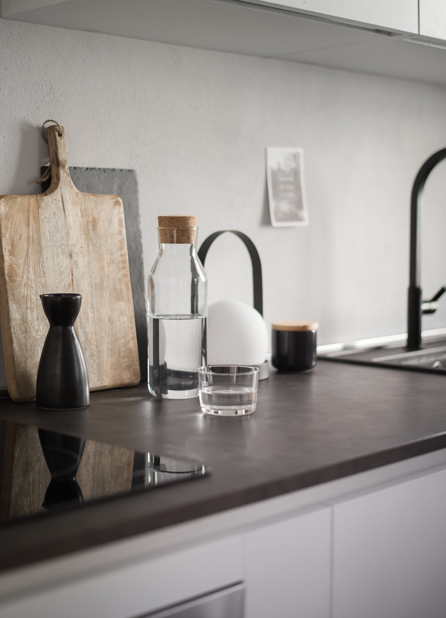
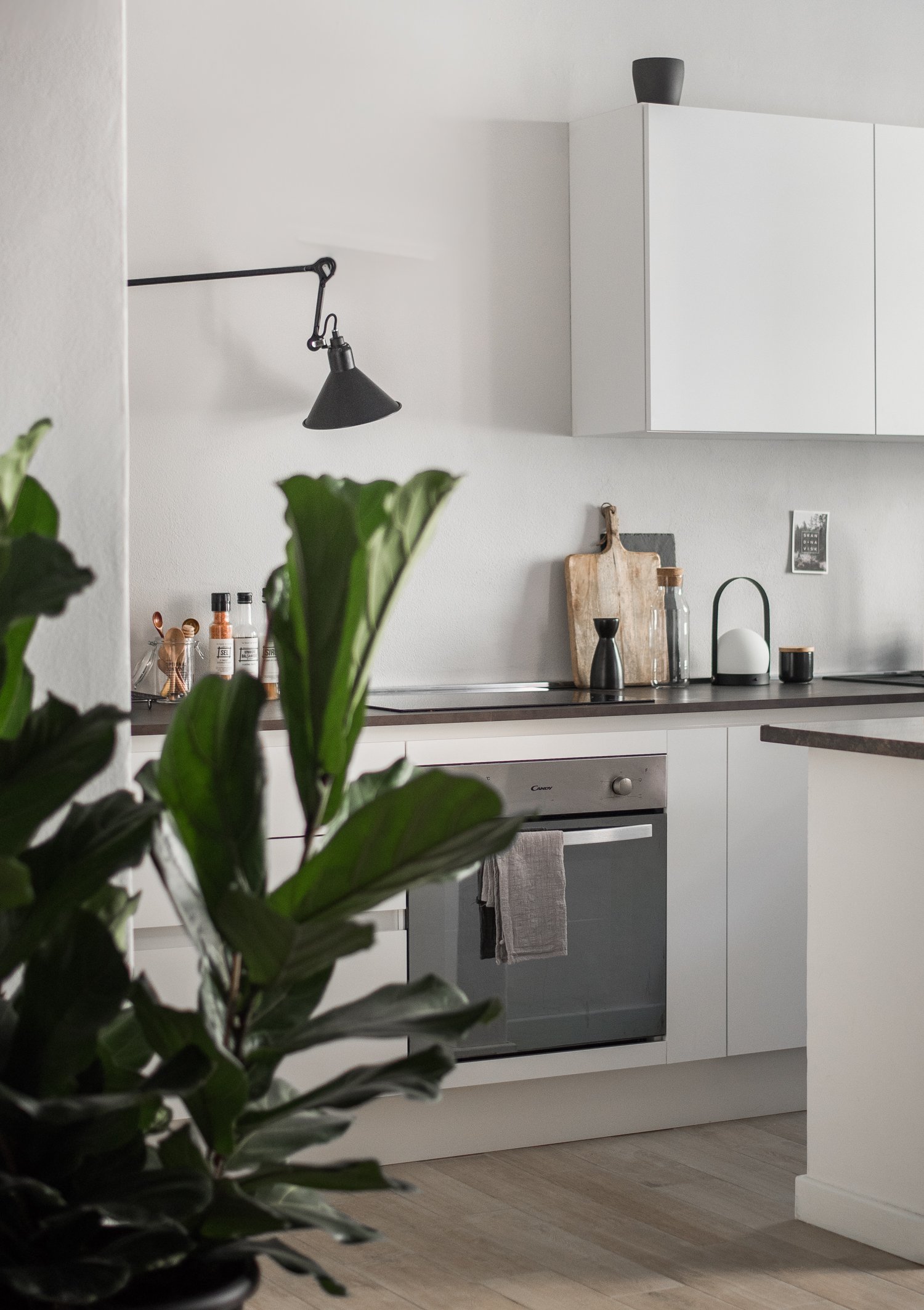
First and most important thing, we wanted an open plan kitchen. A place where we can gather, cook, work in and chat in the evenings or when we have friends and family over. We both love to entertain so that decision was a natural choice for us. We were inspired by the minimal, scandinavian style kitchens which feature simple, functional cabinets and gorgeous, design accessories – muted grey and off-white shades, design lamps, ceramics with personality.
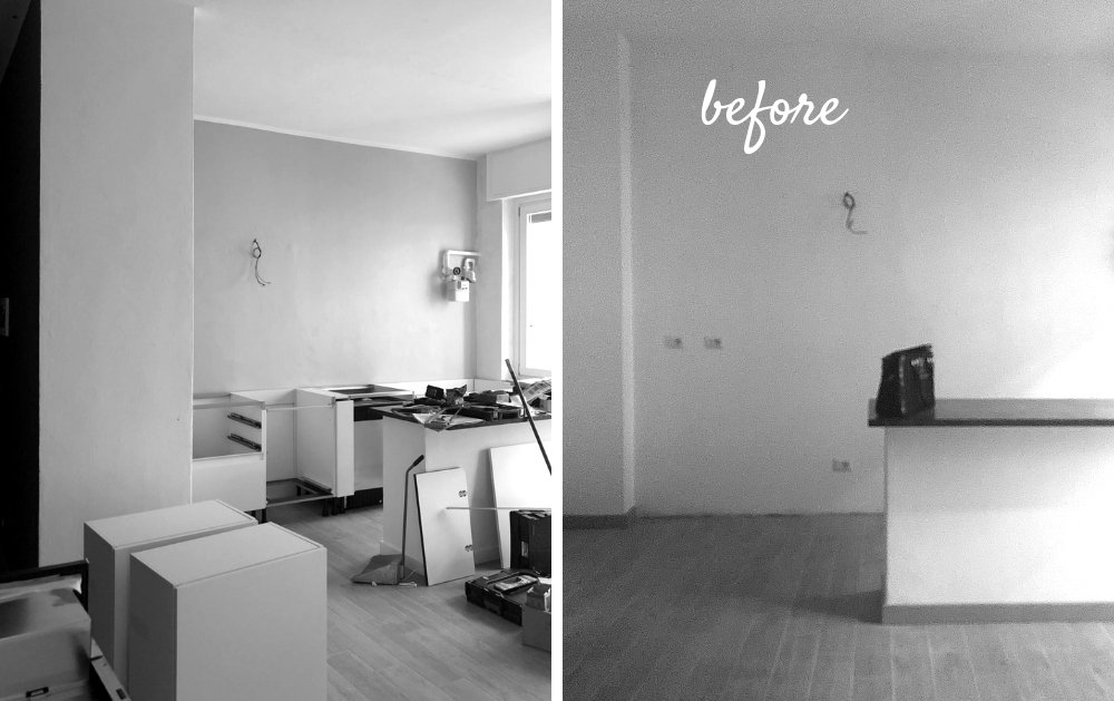
When we first measured the kitchen we understood that we are very far from having 90 degrees angles (Argh!). We had no choice but order a custom made kitchen. After visiting few local studios we decided to hire Francesca Martelli, who shares similar, minimal aesthetics and eye for details.
It seems like minimal kitchens require minimal planning but that’s not entirely true unless you have it all figured out before you start designing. Any kitchen design means a lot of big and small decisions taken based on your scatch and ideas. It is really useful to picture your daily routine to plan the cabinets, storage space and worktop areas. Francesca has been very helpful with that what made the whole process easier.
I love spending time in this corner, having coffee in the morning, making quick lunch during working hours and cooking in the evenings. The airy, light space relaxes and inspires me. I’m not a passionate cook but perhaps I can become one? 🙂
Favourite items?
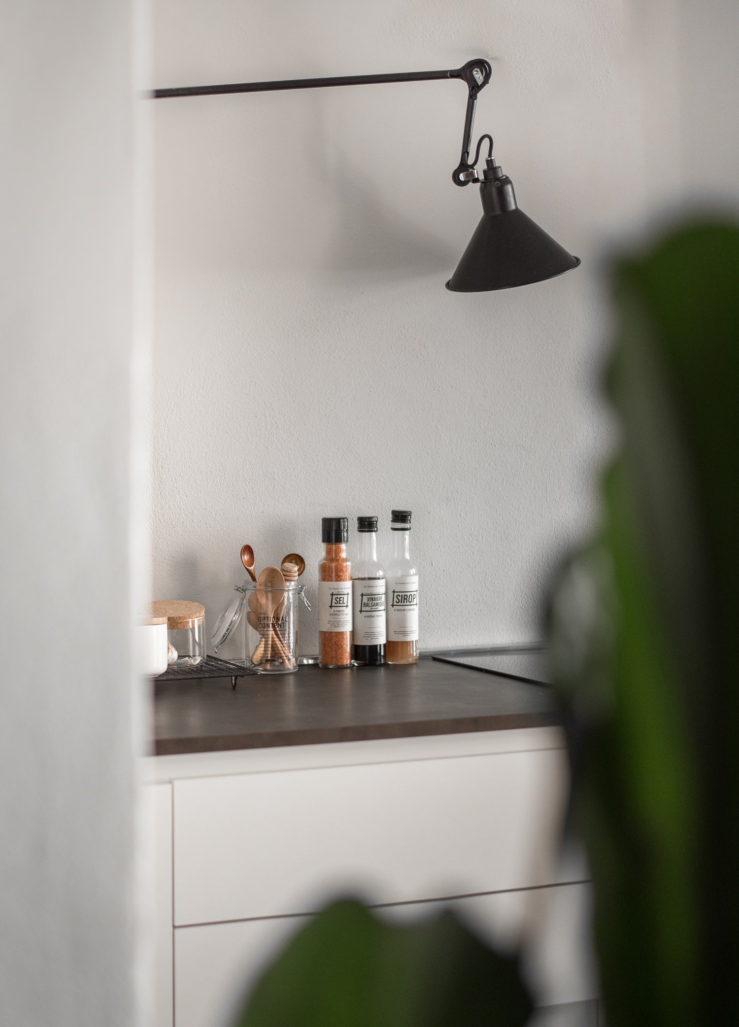
I absolutely love our black matte sink and faucet, DCW Wall lamp, it creates such a homey, effortless light in the evenings making the kitchen feel cozy and inviting. Recently I also added a cute little Menu lamp which I got from my dear friend Holly Becker (she knows my taste so well!)
I’m still looking for a perfect slim rail to hang utencils above the counters, bar stools, open shelves which will fit between the fridge and wall and a few small accessories. I can get obsessed with design objects but I’m trying to keep it minimal, not to clutter it with too many things. For now it seems to be working, what do you think?
Photos: Agata Dimmich / Passionshake


I love this kitchen. Such a minimal design, but it looks fantastic!
This is beautiful!! Thank you for sharing!!
This kitchen is stunning!!