After visiting the Instituto Marangoni design show last year, I was very curious to see the best projects and designers in 2018. It was very refreshing to discover their work, connected by the intriguing theme: ‘Under the Light’ – the performance inspired by the metaphoric concept – light being the new beginning.
Since my main interest is design, I couldn’t wait to see the new projects selected in three design categories. Each year, I find the student’s open outlook very inspiring hence I want to share with you my favourite project (wait for it! the idea is brilliant!)
Here are the top ideas in three different categories:
Interior design
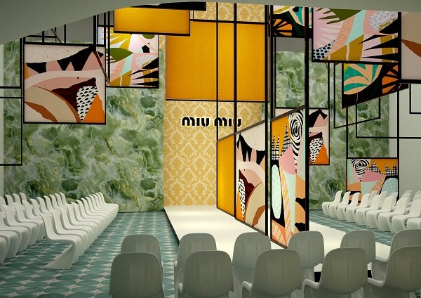
1. Belen Arocena – Before it’s Gone: project to reconvert Cinema Arts into the headquarters and multi-purpose space of the Miu Miu brand.
2. Natali Vorotnykova – Boundless Circle: project to reconvert the Manzoni Theater into the headquarters and multifunctional space
3. Antonio Marras brand. Sharon Foglietta – The Néos: project to reconvert the Manzoni Theater into the Versace headquarters and multifunctional space.
Visual design
1. Yuetong Shi – Viusic: visual identity project for the music album of a Chinese musician.
2. Raushaniya Urmanshina – Beyond The Folds: an app for “I Love Poke”, a Hawaiian fast-food
3. Jiayi Wang – Sustainable Living: environmental communication campaign for the city of Milan.
Product design
1. Margherita Sala – Pump Table: a small table that uses the natural growth cycle of a pumpkin as part of the production process.
2. Arthur Roth Le Gentil – Orbit: an interactive furnishing system that can be customized with a device.
3. Rafaela Vieira – Saudade: a modular, transportable furniture system.
The one that caught my eye the most is the ‘Before it’s gone’ project – the Cinema Arts turning into Miu Miu’s headquarters. A space in which, just as it happens during a theatrical show, scene can be changed according to the event, creating ‘new beginning’ for each show.
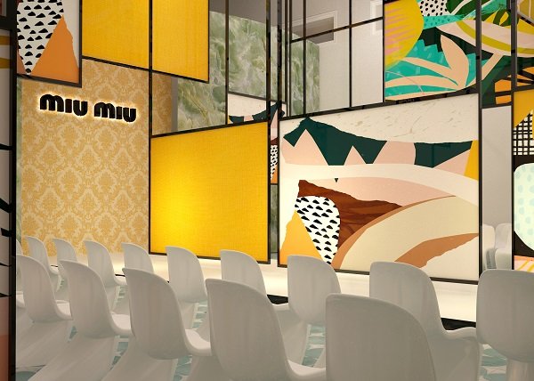
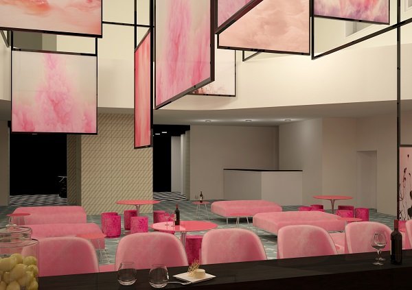
To create this flexible environment, Belen Arocena decided to use dividing panels in the main hall to allow flexibility. Covered with different fabrics each time, they allow ever-changing atmosphere. The idea of the panels is simply brilliant for any creative space!
I would love to use similar panels in my own studio (or at home!) to change the colors and settings every time the mood strikes! What about you? Did it inspire you a little bit?
